Color of the Year Trends and Making a Statement in Your Building
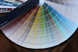
It’s always exciting to hear what paint companies will choose to name the “Color of the Year,” as picks truly can run the gamut from basic whites to soft greens and teal blues to deep, rich reds. This year, green is having a major moment. Benjamin Moore—whose paints we use most often in our projects due to their quality and versatility—announced that “October Mist 1495” will be the hue of 2022.
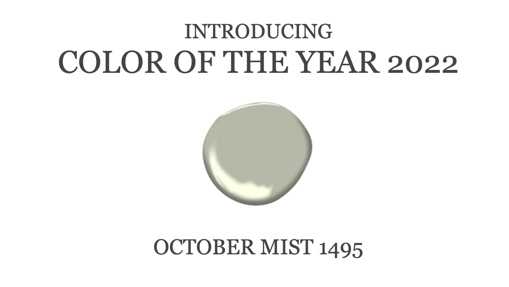
This color is approachable yet classic and timeless; it can be used forever throughout a building coupled either with other neutrals or deeper statement colors. And Benjamin Moore wasn’t alone in calling it a winner. Sherwin Williams’ and Pratt + Lambert’s colors of the year are also comforting greenish grays. Soothing, neutral, classic, timeless, this shade can do it all. Pair it with other soft complimentary colors or allow it to be the backdrop for more dramatic color selections. Either way, this color is a workhorse and has staying power.
While we’re on the subject of trending paints, let’s chat a bit more about choosing colors with regard to lobby interior design and to incorporate into a building as a whole—both on and off the walls. Green is a major go, of course, but in general, when selecting paint for your building, you will want to think about a statement color that conveys a specific mood. Unsure where to begin in your NYC lobby? You may wish to look to your building’s surroundings to determine exactly what color best suits the space. Is there a hue that pays homage to your neighborhood and reflects its location near Central Park or the river, for example? The building’s New York City location can help drive color selections as do the architecture and period of the building.
When it comes to selecting a carpet shade, note that neutrals are still going strong. There is also an emphasis on natural, eco friendly, plush broadlooms. We like to team up this color palette with some darker tones in very “active” patterns so the carpet hides dirt and wear and tear.
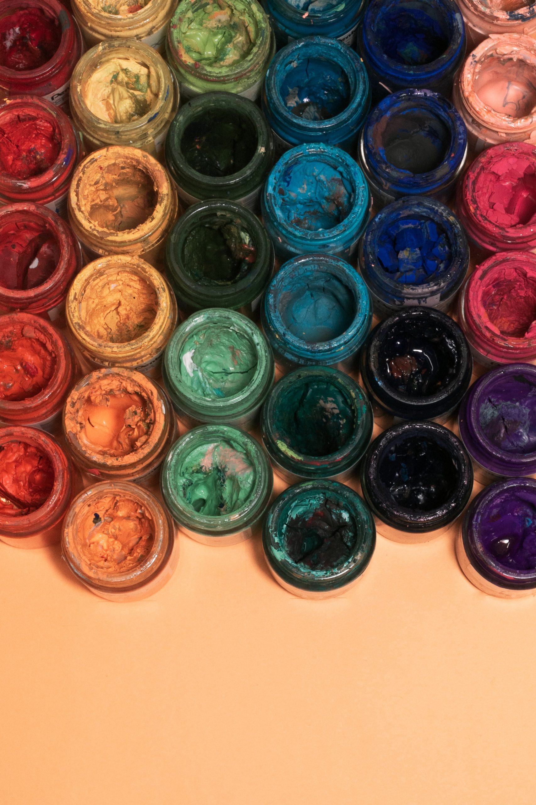
Jewel tones are coming back strong—the fear of making a “statement” in buildings that appeal to younger buyers is over. Rather, these NYC co-op and condo boards are eager to make their building stand out amongst the sea of neutrals. The lure of rich, deep jewel tones are not only practical but also lush, confident and fearless. We’re all about it! In lobby spaces and hallways, we love to use a pop of color on a select piece of furniture or just in the artwork. It makes life interesting and even playful, and once it becomes tired, it can easily be changed out for the newer fresh look.
In general: Don’t underestimate the power different colors can have within a building’s space. Make your decisions thoughtfully and you’ll thank yourself later!
Sygrove Interior Design Services
Sygrove Associates Design Group is an NYC interior design company. Our company’s founder Marilyn Sygrove is the lead interior designer on all projects. And she’s as tough as you are when it comes to quality, aesthetics, and coming in on time and on budget.
It all starts with a design consultation with Marilyn. She takes the time to thoroughly understand your design needs then personally directs all interior design, planning, and installation activities. Her work has been delighting clients, co-op and condo boards, and homeowners for over 30 years.
You can reach Marilyn by email at hello@sygrove.com or call her directly at 212.757.0631.